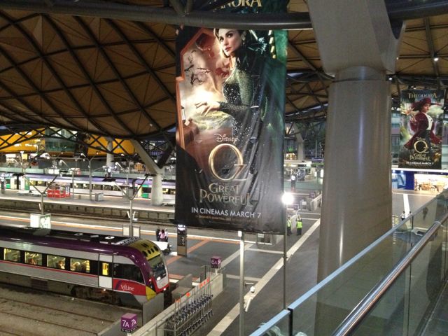
 We walked into the Melbourne train station to shortcut to the other side of the road and was surprised to see such an unusual design. There are so many design contrasts in this city. In the CBD, there are beautifully preserved heritage buildings right next to sensibly-designed modern ones.
On my very first trip to Melbourne in 2000, I remember noticing that all the hotels we stayed had very modern interiors. The renovated hotels used straight clean lines with lots of chrome and glass. Outside the hotel though, the city looked like it was in a time warp. It had that "retro" feel, with the trams and old buildings.
I don't even remember where we stayed then, but the city now looks totally different. It looks much more modern now, but with a healthy respect for things that are old--and the contrast gives the city so much character. I think developing countries can learn a lesson from this instead of tearing everything down to build commercial establishments that hardly have any design aesthetic.
The hotels we stayed in were not trying to be uber-modern, but were just relaxed modern.
When we entered this train station, I just stopped in my tracks (pun intended), looked up and said WOW!
From the pictures online, it looks like it's even more beautiful at night.


No comments:
Post a Comment