Here is the room at the new Marina Bay Sands in Singapore.This is a Horizon room facing the water.
I forgot to take a picture of the wall facing the bed but you can see that there is a flat screen TV across the bed, and to the left of the TV is an executive desk. I prefer taking daytime shots of rooms, except that if I waited till the next morning, the room would be too messy. This was taken the evening we walked into the room, so it's still at its neatest!
One of the first things I check out are the closets even if I never really unpack my suitcase.
I want to see what the drawers look like and the lighting inside the closet too.
I love to check out the bathroom--for configuration, amenities and other little "wow" effects, if any. I liked the color and the pattern on the granite on the counter. It was a nice warm gray. Lighting was also very good--two side lights and two overhead halogens. Very flattering vanity lighting.
I always think big-sized amenities are a waste since they replace them everyday anyway. Well specially if you wipe out the whole counter every morning and stash the loot in your suitcase! I usually give them as pasalubong to the house staff--one full set each. It's very much appreciated.
I think the bathtub area looks a bit spartan, but
my modern-style 8-year-old daughter likes this picture a lot.
The toilet is in its own little room with a frosted door. I don't understand when interior designers/architects design bathrooms with a separate stall for the toilet, only to use clear glass as the partition. It defeats the purpose of enclosing the toilet for privacy, and actually makes
the person inside look like he or she is on display! Either make it a "modesty" partition, or none at all.
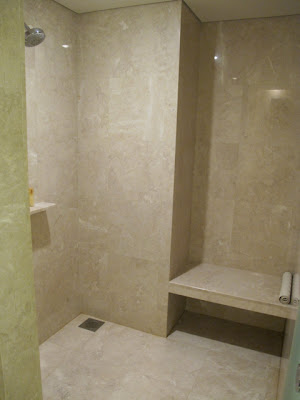
The shower stall is big, but the bench is also on the far side and there's no telephone shower unit that can reach it. So this bench is useful only for bringing in a towel into the stall, to use after a shower.
The bathroom double doors open up into the entryway of the room, but also faces a full length mirror. This is a nice detail since you can use the whole depth of the bathroom to see yourself from afar.
And if you think I've scrutinized the bathroom enough...
A peek at the underside of the counter reveals that the granite is mounted on plywood and metal supports only. This is always neater and cleaner and much faster to do. I mention this because I can't figure out why contractors here always pour a slab of concrete to create a counter whether it be a kitchen or a bathroom counter.
I've tried to tell contractors to do it with a minimum of fuss--just a wooden frame like the one in the hotel bathroom and they always insist the wood will rot, be a magnet for insects, etc.
The concrete installation is always harder to renovate later on.
This 45th floor room had a nice view. But then again, if your room didn't have a view, you could always trek up to the 57th floor for a spectacular view of the city from the SkyPark!


4 comments:
What an incredible room! I actually love the bathtub too, though I could do without the big mirror next to it. That is an amazing view too.
I'm so glad you DO look under the counters to give great tips on the construction!
I get many renovation ideas from everything I observe and photograph, so it's really helpful! I should post more of these "sleuth shots". Thanks for stopping by.
Looks like I live in condo in Philippines. Beautiful views inside and out! :)
Post a Comment